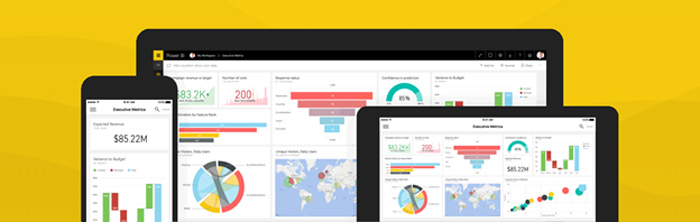
| | Excel announces new data visualization capabilities with Power BI custom visuals
Custom visuals have become a key part of Power BI allowing users to tap into hundreds of different visualizations. It is hard to believe that a little over two years ago we announced the availability of the first batch of custom visuals in Power BI Desktop and the Power BI Service. But custom visuals go far beyond the world of Power BI users. As part of Build, we announced that Power BI Custom Visuals will be rolling out in Preview to Office 365 subscribers enrolled in the Office Insiders program soon, extending Excel charting capabilities and more than doubling the data visualization options for the most widely used data analytics tool in the world. | | | | | Power BI Desktop May Feature Summary
This month we have major updates across all areas of Power BI Desktop. Along with many other reporting features, we have our biggest update to conditional formatting in while, the ability to format any fields, including strings and dates, by a different numeric field in the model. Drillthrough also gets a major update this month with the ability to carry all filters through to the destination page. We are also enabling enterprise level scalability through incremental data refresh. | | | | | ArcGIS Maps for Power BI
Esri’s ArcGIS Maps for Power BI now supports organizational GIS and organizational purchase of Plus subscriptions.
ArcGIS Online is Esri’s location platform, where organizations worldwide store and analyze their location-based data. With the May release of Power BI desktop, the ArcGIS Maps for Power BI visual allows users to sign in with their ArcGIS Online credentials to access private layers and custom basemaps hosted in their ArcGIS Online organization.
In addition, ArcGIS Maps for Power BI now also supports organizational purchase of Plus subscriptions. The Plus subscription for ArcGIS Maps for Power BI provides access to more maps, global demographics, verified ready-to-use data, and plot even more locations on your maps for compelling visualizations. It is available for individual purchase within the visual or it can be purchased for an entire organization at once. Organizations can purchase Plus for their entire organization by selecting a small, medium, or large plan based on how many potential Power BI users are within their organization.
For additional information, please visit Esri’s Getting started page. | | | | | The Art and Science of Action-Driven Visual Analytics
In the world of big data, a visualization is merely a vehicle – a vehicle for us to create patterns, familiarity, and salience with data so that we can attract users’ attention and tap into their iconic memories, but to convince them to take actions.
Action-driven visual analysis is never about the beauty of the chart, but rather the thought process that goes behind it: identify what is important for your audience, and then use visualization tools to surface what they care about. | | | | | Power BI Revs Up NASCAR Fantasy Game
Microsoft and NASCAR have a history of working together to bring technology to the forefront of the NASCAR business, making the sport safer and significantly increasing its fairness. Another primary goal for NASCAR is to find new ways to increase and enhance fan engagement. This includes sharing the wealth of data NASCAR collects from cars, drivers, tracks and teams with fans, in a new and compelling way. That's why we’re so excited about our collaboration within the re-launch of NASCAR's fantasy game. | | | | | Webinar May 22: Draw the right insights with Power BI and Visio
Join us for this webinar to learn how to combine Power BI dashboards and Microsoft Visio diagrams to create powerful visual insights.
Visio and Power BI are highly visual and naturally complementary. Visio lets you create illustrative diagrams, such as interconnected workflows and real-world layouts. Power BI helps you build intuitive dashboards using charts and maps to measure key performance indicators and track goals. | | | |
|
|
沒有留言:
張貼留言